What’s the Opposite of Purple
Color, an integral aspect of our sensory experience, enriches our lives in ways both subtle and profound. It influences our emotions, perceptions, and even our decisions. Among the vast spectrum of colors, purple stands out with its enigmatic allure, symbolizing mystery, creativity, and royalty. But have you ever paused to ponder what lies at the opposite end of this captivating hue? Delving into the realms of color theory, we embark on a quest to unravel the mystery of the opposite of purple.
Understanding Color Theory:
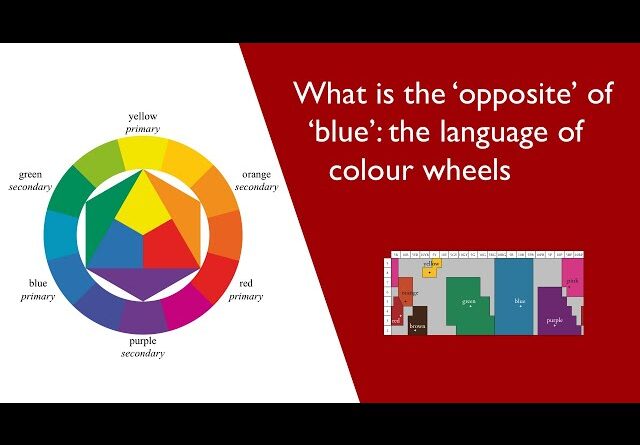
To comprehend the opposite of purple, we must first delve into the fundamentals of color theory. The traditional color wheel, a cornerstone of this theory, arranges colors in a circular format, demonstrating their relationships and contrasts. At the heart of this wheel lies purple, positioned between red and blue. This placement signifies purple’s composite nature, borrowing attributes from both its neighboring hues.
Opposite on the Color Wheel:
According to the principles of color theory, the opposite of a particular hue is its complementary color. Complementary colors sit directly across from each other on the color wheel, creating the most striking visual contrast when placed side by side. In the case of purple, its complementary color lies opposite on the wheel, and this color happens to be yellow.
Yellow: The Antithesis of Purple:
Yellow, often associated with sunshine, warmth, and optimism, emerges as the antithesis of purple. While purple embodies depth and complexity, yellow exudes vibrancy and cheerfulness. Where purple commands attention with its regal presence, yellow captivates with its radiant glow.
Psychological and Cultural Associations:
Beyond their visual juxtaposition, purple and yellow evoke distinct psychological and cultural associations. Purple’s historical ties to royalty and spirituality infuse it with a sense of mystique and grandeur. In contrast, yellow’s associations with sunshine and enlightenment evoke feelings of joy, hope, and intellectual clarity.
Impact on Emotions and Perception:
The contrasting nature of purple and yellow extends beyond mere aesthetics, influencing our emotions and perceptions in profound ways. While purple may evoke feelings of introspection, luxury, or even melancholy, yellow uplifts spirits, instilling feelings of happiness, optimism, and energy. Their juxtaposition creates a dynamic interplay, offering a rich tapestry of emotional experiences.
Exploring Symbolism:
Symbolism often imbues colors with layers of meaning and significance. Purple’s symbolism encompasses notions of spirituality, creativity, and wisdom, drawing upon historical associations with royalty and mysticism. In contrast, yellow symbolizes concepts of light, intellect, and enlightenment, evoking imagery of fields of golden sunshine and vibrant blossoms.
Applications in Art and Design:
The interplay between purple and yellow finds expression in various artistic and design endeavors. Artists leverage their complementary nature to create visually striking compositions that play with contrast and harmony. Similarly, designers utilize this dynamic duo in fashion, interiors, and branding to evoke specific moods, convey messages, and create memorable experiences.
Cultural and Historical Significance:
Throughout history, purple and yellow have held significant cultural and historical prominence. Purple, once a symbol of wealth and power reserved for royalty, retains its aura of prestige and sophistication. In contrast, yellow has traversed diverse cultural landscapes, symbolizing everything from divinity and enlightenment to cowardice and betrayal.
Practical Applications in Everyday Life:
In our everyday lives, the interplay between purple and yellow manifests in myriad ways. From interior décor and fashion choices to marketing campaigns and visual branding, these colors leave an indelible imprint on our surroundings and experiences. Whether consciously or subconsciously, we encounter their dynamic contrast and harmonious balance in the world around us.
Conclusion:
In the colorful tapestry of existence, the opposite of purple emerges not as a mere chromatic counterpart, but as a vibrant expression of contrast and harmony. Yellow, with its luminous warmth and optimistic spirit, stands in stark juxtaposition to purple’s enigmatic depths and regal allure. Together, they form a dynamic duo, weaving tales of contrast and harmony that enrich our sensory experiences and shape our perceptions of the world. As we delve deeper into the realms of color theory, we uncover not just hues on a wheel, but reflections of our emotions, cultures, and histories, each shade a brushstroke in the masterpiece of existence.